Summary
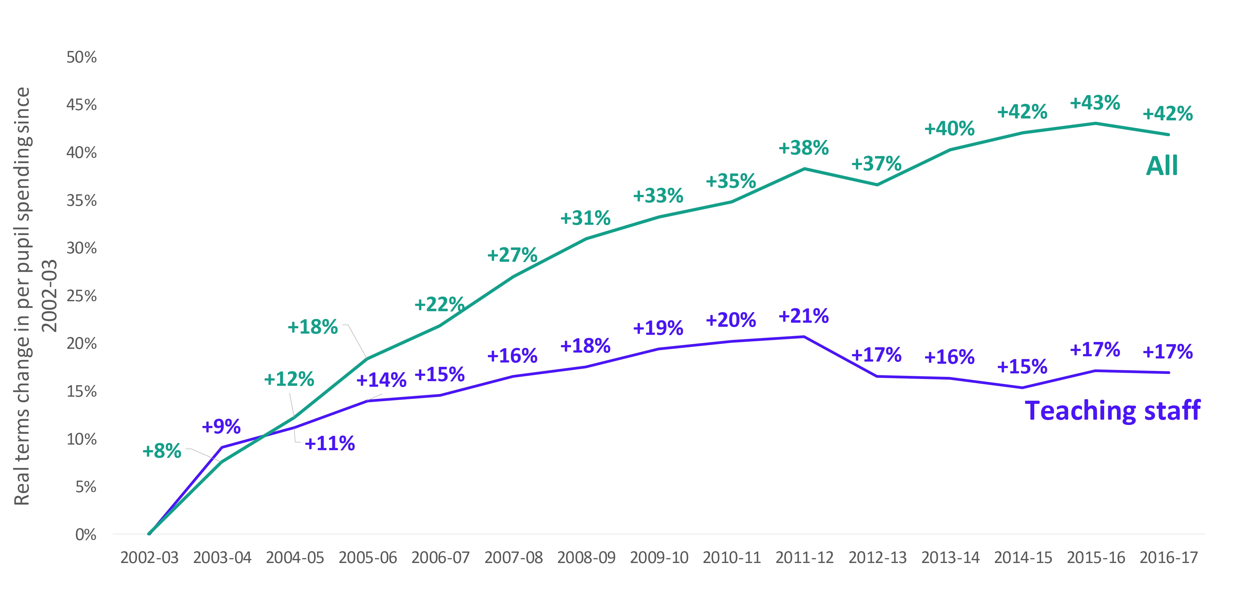
- Between 2003 and 2017, per pupil spending on teaching staff increased at a much slower rate than spending overall (a real terms increase of 17 per cent versus 42 per cent across all expenditure).
- In our sample of schools, median per pupil spend on teachers amongst each of primary, secondary, and special schools fell in real terms between 2010 and 2017, having increased considerably in the seven years before that. But all remained above the levels of expenditure in 2003; in fact, secondary schools that were the lowest spending on teachers in 2017 were still well above the highest spending secondary schools from 2003.
- Being a school in London (where teacher salaries are higher), or with high levels of disadvantage, was associated with the highest level of expenditure on teachers in both primary and secondary schools. In secondary schools, those with high proportions of pupils with English as an additional language had expenditure that was also well above average. These groups of schools saw the largest increases in expenditure on teachers between 2003 and 2017 (though there were generally falls between 2010 and 2017).
- Secondary schools that would later join large academy trusts appear to have had some of the largest increases in expenditure between 2003 and 2010 (pre academisation) but then some of the largest reductions between 2010 and 2017. They also saw some of the largest fluctuations in their pupil teacher ratios. This could reflect a different approach to workforce management and deployment in these trusts.
Overall trends in expenditure on teachers
Between 2002-03 and 2016-17, overall per-pupil expenditure in schools increased by 42 per cent in real terms. However, expenditure on teachers increased much more slowly, at 17 per cent, reaching £2,811 in 2016-17. Real terms per pupil expenditure peaked in 2011-12 at £2,902 and expenditure in 2016-17 was only just above the level seen in 2007-08 (by £10) (Figure 1).
Figure 1: Change in real terms per pupil expenditure on teaching staff and across all expenditure between 2002-03 and 2016-17
What we are particularly interested in in this series is how these trends vary by different school characteristics. In order to do this, we have constructed a school level dataset from the schools Consistent Financial Reporting and Academies Accounts Return, looking at expenditure in 2002-03, 2009-10 and 2016-17. Because of the incompleteness of these datasets It has only been possible to do this for a subset of schools – just over half of all primary and secondary schools and about two-thirds of special schools. As such, the results are not directly comparable from the national level results and should be treated with caution, but we believe they reflect the broad underlying patterns.
Trends by phase
Figure 2 shows the distribution of expenditure by phase based on this sample of schools for which we have complete data. As would be expected from our analysis looking at trends in teacher numbers, secondary schools spend more per pupil on teachers than primary schools – since average salaries are higher and PTRs are lower in secondary schools than primary.
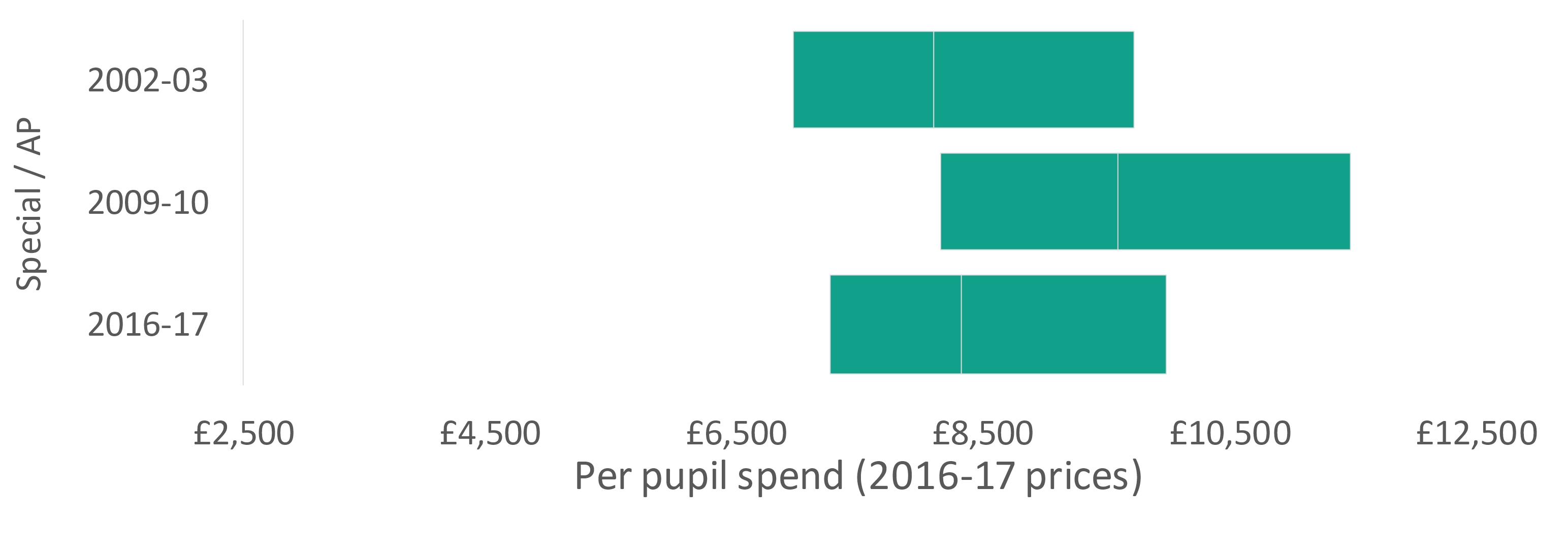
The results for the just over 600 special schools in our sample are some of the most striking (though the relatively small number included do make results more volatile and sensitive to approach taken) Per pupil spending increased rapidly between 2002-03 and 2009-10, before falling back again so that per pupil expenditure in 2016-17 was more like spending in 2003 than in 2010. Between 2003 and 2010 the number of pupils in special schools was broadly stable, but expenditure on teachers over this period increased significantly – and as seen in the previous analysis, the pupil teacher ratio began to fall. However, between 2010 and 2017 the number of pupils in special schools increased by nearly a quarter – faster than the 14 per cent increase in primary schools at a time of a ‘population bulge’ – and expenditure on teaching staff does not appear to have kept pace. But, as we saw in part 2 of this series, median overall expenditure remained at broadly the same level in these schools. This suggests that other areas of expenditure did see increases over this period.
Figure 2: Distribution of per pupil expenditure on teachers (lower quartile, median, upper quartile) by school phase 2002-03 to 2016-17
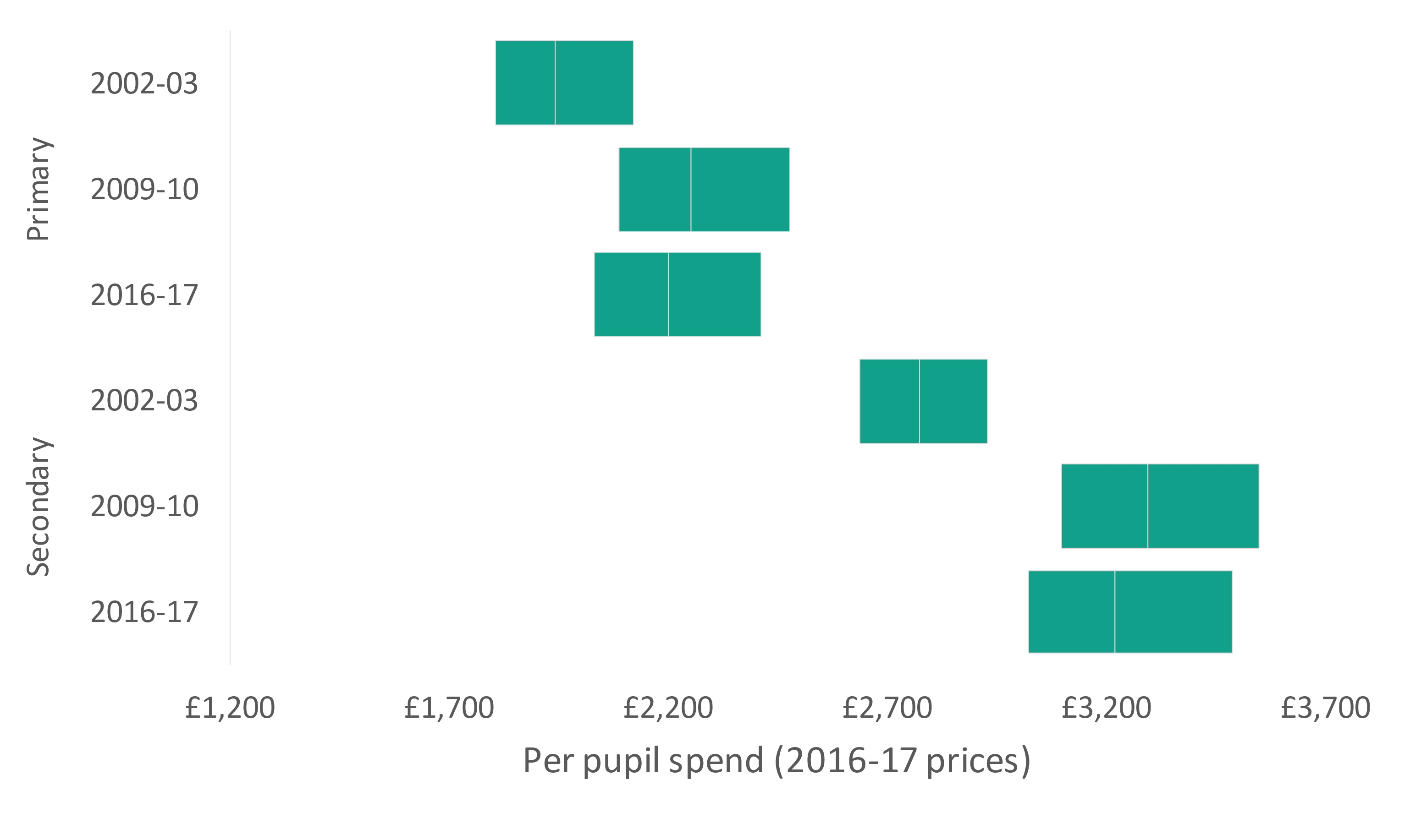
In 2016-17 the median per pupil expenditure on teaching staff in secondary schools was just over £3,200 – this was £450 higher than in 2002-03 but actually represented a fall of £75 from 2009-10. Primary schools followed a similar pattern with a median expenditure of £2,200 representing an increase of £260 from 2002-03 but a fall of £50 since 2009-10.
In these primary schools, the highest spenders (upper quartile) spent around 20 per cent more than the lowest spenders (lower quartile), the difference equating to around £380 per pupil. In an average sized primary school (around 275 pupils), this would equate to an additional £105,000 a year – equivalent to more than two additional classroom teachers.[1] Amongst secondary schools the difference is 15 per cent and equivalent to £460 per pupil. In an average sized secondary school (960 pupils), this would equate to an additional £440,000 – equivalent to nearly ten additional classroom teachers.[2],[3]
These ratios were broadly the same for primary schools in 2002-03 but have increased slightly for secondary schools. In other words, amongst this group of secondary schools, there was a growing gap between the top and bottom in terms of their spend on teachers – however, the distribution as a whole has moved and so spending on teachers in a lower quartile school in 2016-17 was still well above what an upper quartile school was spending in 2002-03.
Expenditure by school characteristics
That is not to say that that schools spending the least can, or should, make efficiencies elsewhere so that they can spend on teachers instead, nor that those spending the most can reduce to the level of the lowest spenders. Clearly the circumstances that the school is operating in are going to affect their level of funding, their costs, and the decisions they make on spending priorities.
Figure 3 shows the median school spend per pupil on teaching staff in our sample of primary schools by the range of school characteristics introduced previously. We can see that across most characteristics the expenditure is broadly consistent – i.e. the characteristics do not make that much difference to the level of spending. For example, the difference between all non-London schools towards the bottom of the distribution and all high EAL schools is equivalent to around £50 per pupil.
It is when we compare non-London schools with London schools, and low FSM schools with high FSM schools that we see the real differences. In 2016-17, being a primary school in London meant spending £265 more per pupil on teaching staff than a school outside of London; being a school with high levels of pupils eligible for free school meals meant spending £195 more than a school with low free school meal eligibility. (Note that the groups presented here are not mutually exclusive and so for example, part of the London effect could be because of having a large number of highly disadvantaged schools and vice versa).
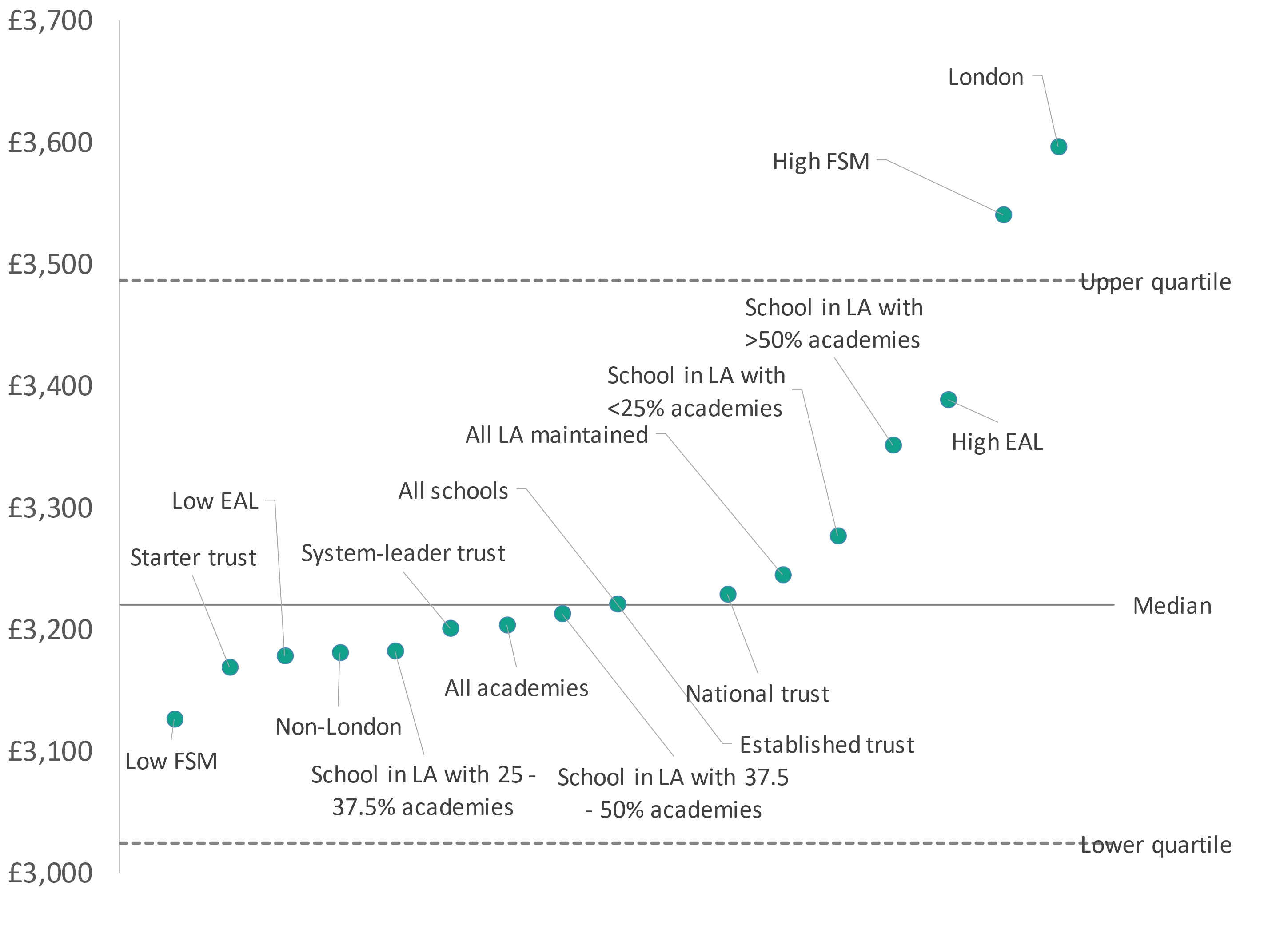
The differences amongst our group of secondary schools are greater still, with the difference between being in London or outside of London, and the difference between being high FSM and low FSM, both equating to around £400 per pupil (Figure 4.)
Median per pupil expenditure on teachers in London was around 8 per cent higher than elsewhere for primary schools and around 9 per cent for secondary schools. This is actually smaller than the average differences in salary costs identified through the Department for Education’s area cost adjustments for funding – where funding has been adjusted to account for higher teacher salaries in the capital which have been calculated as around 19 per cent higher in inner London and 10 per cent for outer London.[4]
Figure 3: Median per pupil spend on teachers in 2016-17 by school characteristics and structures – primary schools
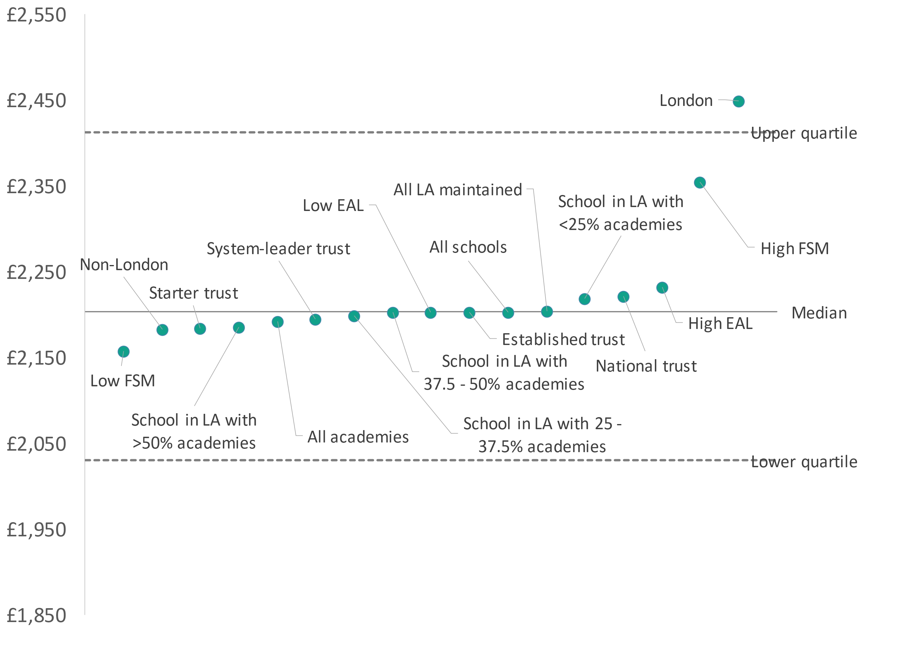
Figure 4: Median per pupil spend on teachers in 2016-17 by school characteristics and structures – secondary schools
The charts above show that characteristics associated with higher per pupil spending on teachers are broadly consistent between primary and secondary schools. However, there are some characteristics where the gap between primary and secondary schools is different from what we might expect given overall averages – implying that this factor affects the phases differently.
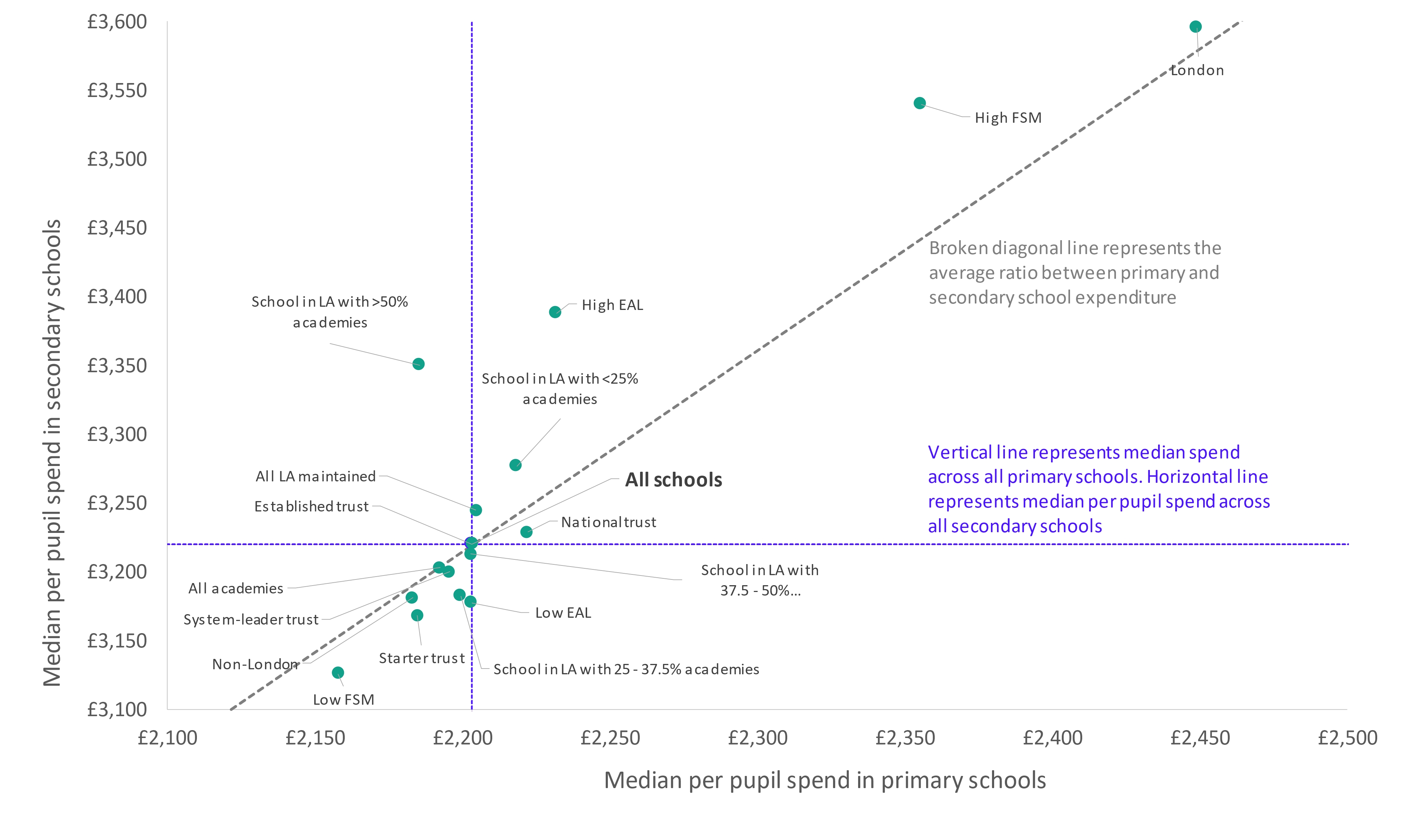
In Figure 5 we plot the median per pupil spend on teachers in 2016-17 by the same set of characteristics. The diagonal line indicates where the ratio of spend between primary and secondary schools is in line with the national average (secondary spend around 46 per cent higher than primaries in our sample of schools).
Most characteristics are quite close to this line, however, there are some characteristics that deviate further:
- median spend in schools with high free school meal eligibility was 50 per cent higher in secondaries than primaries;
- median spend in schools with high EAL was 52 per cent higher in secondaries than primaries; and
- in local authority schools operating in areas of high academisation (more than half of pupils in the area attend an academy), spend in secondary schools was 53 per cent higher than in primaries, though the pattern is inconsistent across different levels of academisation.
Figure 5: Comparison of median per pupil spend on teachers in 2016-17 by characteristics and structures – primary vs secondary schools
Changes in expenditure by school characteristics
We can explore these relationships further by looking at the change in per pupil expenditure in each of these groups between 2002-03 and 2009-10 and between 2009-10 and 2016-17. Figure 6 (primary schools) and Figure 7 (secondary schools) show the changes in each period and the overall change by the same range of characteristics.
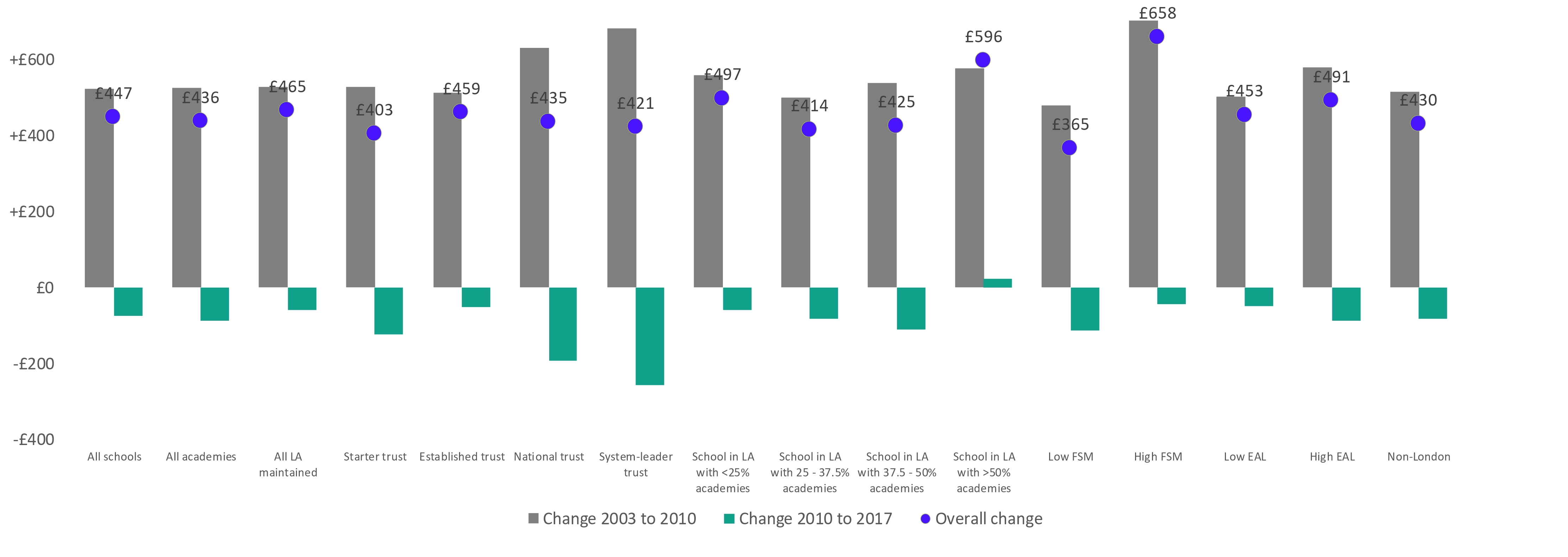
Amongst primary schools, those with high levels of disadvantage saw the largest increases between 2003 and 2010 with median spending on teachers increasing by £417 or 21 per cent (against an average increase of 16 per cent). This was offset slightly between 2010 and 2017 where median spend dropped by £69 or 3 per cent. Schools with low levels of disadvantage on the other hand saw more modest increases of £279 per pupil (14 per cent) between 2003 and 2010 followed by a fall of £48 (2 per cent) between 2010 and 2017. Amongst secondary schools, it was also the schools with high levels of disadvantage that saw big increases between 2003 and 2010, this time £702 or 24 per cent (against an average increase of 19 per cent) before dropping back slightly.
Figure 6: Change in median per pupil spend between 2002-03 and 2016-17 – primary
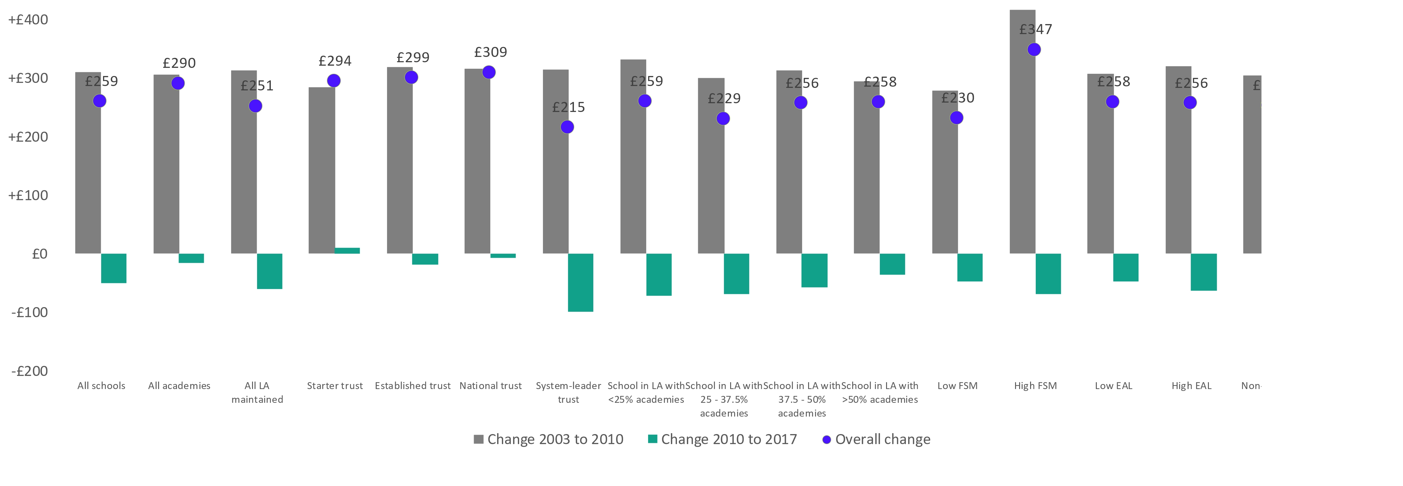
Figure 7: Change in median per pupil spend between 2002-03 and 2016-17 – secondary
There are some interesting patterns when we consider academies. The labels that we apply here refer to the status of the school as at 2016-17, but when we look at the historic data for academies we are really meaning their expenditure as a local authority school. Data was not collected for academies prior to 2010 and such schools are excluded from the analysis. This means we have a useful break point, pre- and post- mass academisation.
Between 2003 and 2010, the median spending on teachers for secondary schools increased by 19 per cent. This was the same for schools that went on to become academies and those that remained as local authority schools. Those schools that would later go on to join large national trusts increased by 23 per cent, and those that would go on to join the largest, system-leader, trusts a further one percentage point higher. Remember, this pre-dates their academisation so must reflect some other characteristic of the school.
Post 2010, expenditure across all local authority secondary schools fell by 2 per cent and across all academies by 3 per cent. But in the largest trusts the falls were much bigger – 6 per cent in national trusts and 7 per cent in system leader trusts. While the position is less clear in primary schools, it is still academies in system leader trusts that saw the biggest falls
While we do not demonstrate precisely when and how these changes happened in this analysis we hypothesise that reasons for this could include that:
- some of the largest academy trusts have been at the forefront of promoting and embedding curriculum based financial planning in order to achieve efficiencies (i.e. by deploying staff in such a way as to deliver the curriculum most efficiently);
- trusts are cutting back on the number of middle and senior leaders in school by having roles at trust level instead. We have generally found no systematic differences between academies and local authority schools in terms of their mix of leadership levels, though secondary schools in large academy trusts do have a slightly higher proportion of teachers that are classroom teachers; and
- trusts are spending less per teacher by having a disproportionate number of early career teachers on lower average salaries. We found previously that system leader trusts tend to have a higher number of new entrants and that their teachers achieve promotion at a younger age.
Pupil teacher ratios
A further way to look at to look at the deployment of resources is the effect that it has had on pupil-teacher ratios by different groups. As we saw in the previous paper, PTRs have increased recently after a period in which they had been falling. But in 2017 they were at the level they were in 2005 (which in turn is below the level they were at in 2003). So, when we look at the PTR in our three key years, they are covering a slightly different time period, and pattern, from the previous analysis.
We can see from Figure 8 and Figure 9 that across all our characteristics, the median PTR in primary schools was lower than it had been in 2003. Those characteristics with the highest teacher expenditure – being in London and being in a high FSM school – have the lowest PTRs. So we have seen that:
- schools in the capital spend more per pupil on teachers than they do elsewhere; but
- the difference is smaller than you would expect given the differences in teacher pay between London and other parts of the country; yet
- London still maintains pupil teacher ratios that are below the average.
This implies that London has disproportionately more teachers who are in some sense ‘less expensive’ – for example early career teachers. This is consistent with other research that shows that London’s teaching workforce is on average younger than other regions, and that teachers are more likely to move out of London than other regions as they build their experience.[5]
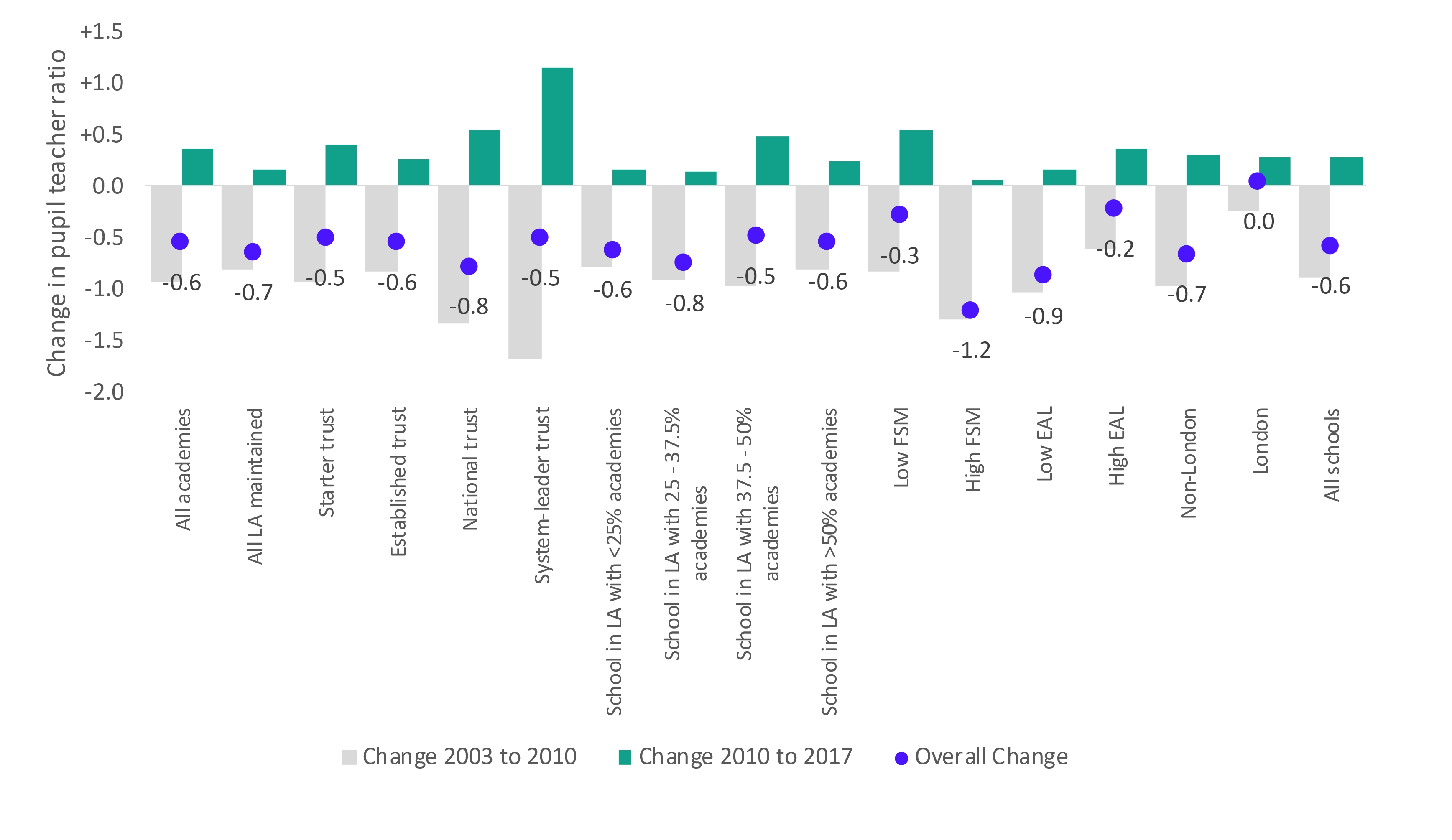
Most of the falls in the PTR seen occurred during the period 2003 to 2010 with slight reductions in most groups after that. System leader trusts, national trusts and established trusts all saw increases between 2010 and 2017.
This pattern for academy trusts is starker when looking at secondary schools. Schools that later went on to join system leader trusts had seen big reductions in their PTRs between 2003 and 2010, falling from 16.0 to 14.3, before climbing to 15.4 in 2017 (following a similar pattern to per pupil expenditure changes). So, having started as about average, the PTR in schools that would later go on to join system leader trusts then had amongst the lowest PTR (only high FSM schools were lower) before returning to average. There is overlap with the high FSM group in terms of the schools considered, but the high FSM group as a whole has not seen the same pattern. They saw similar falls between 2003 and 2010, before holding at that level to 2017.
Figure 8: Pupil teacher ratio 2002-03 and 2016-17 – primary
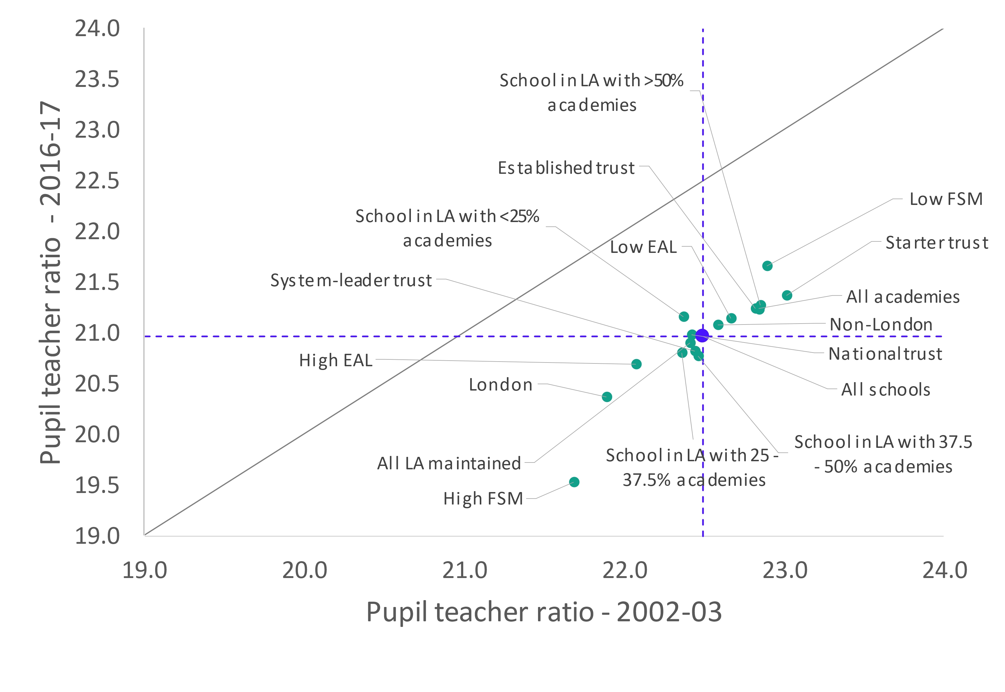
Figure 9: Change in pupil teacher ratio between 2002-03 and 2016-17 – primary
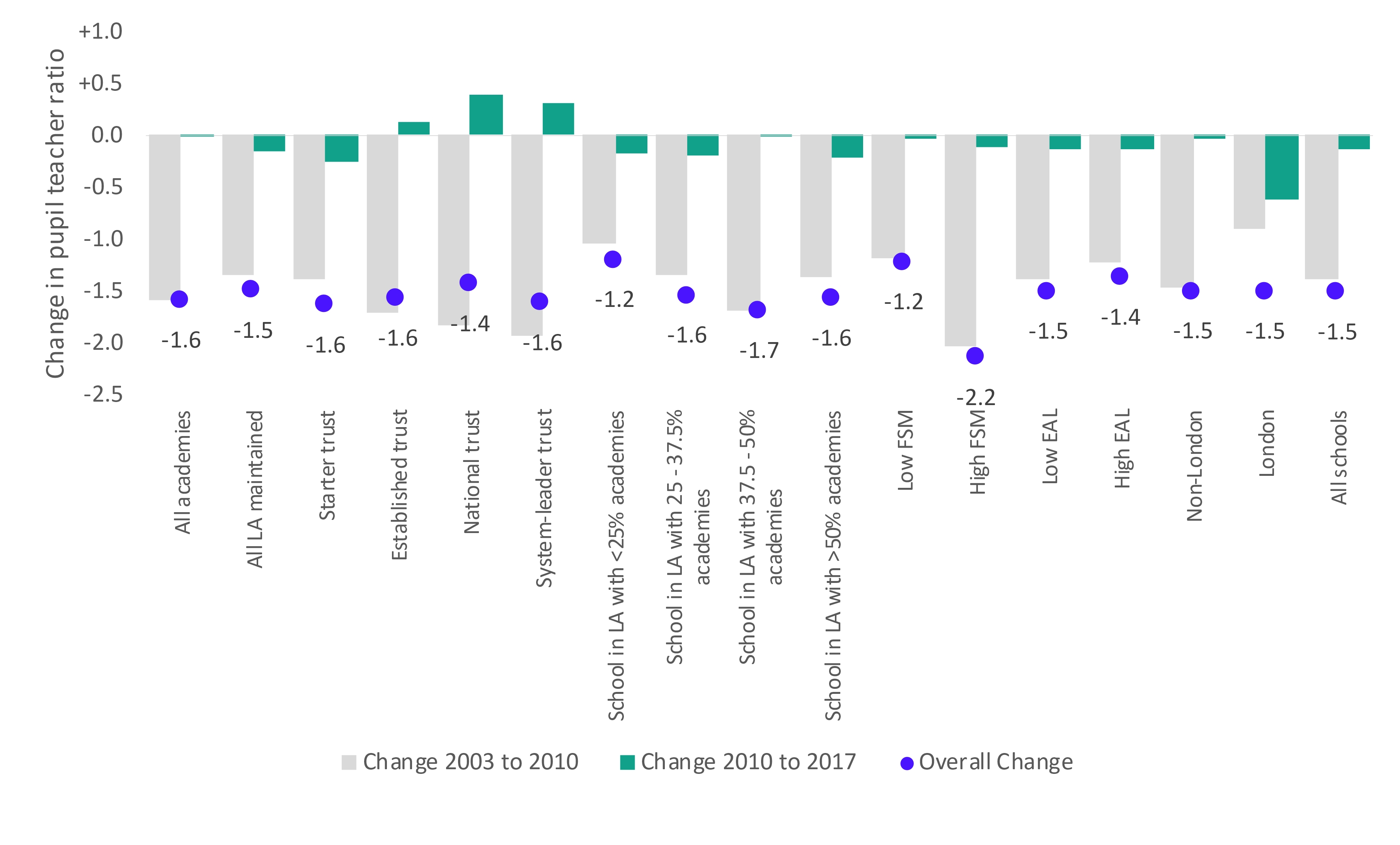
Figure 10: Pupil teacher ratio 2002-03 and 2016-17 – secondary
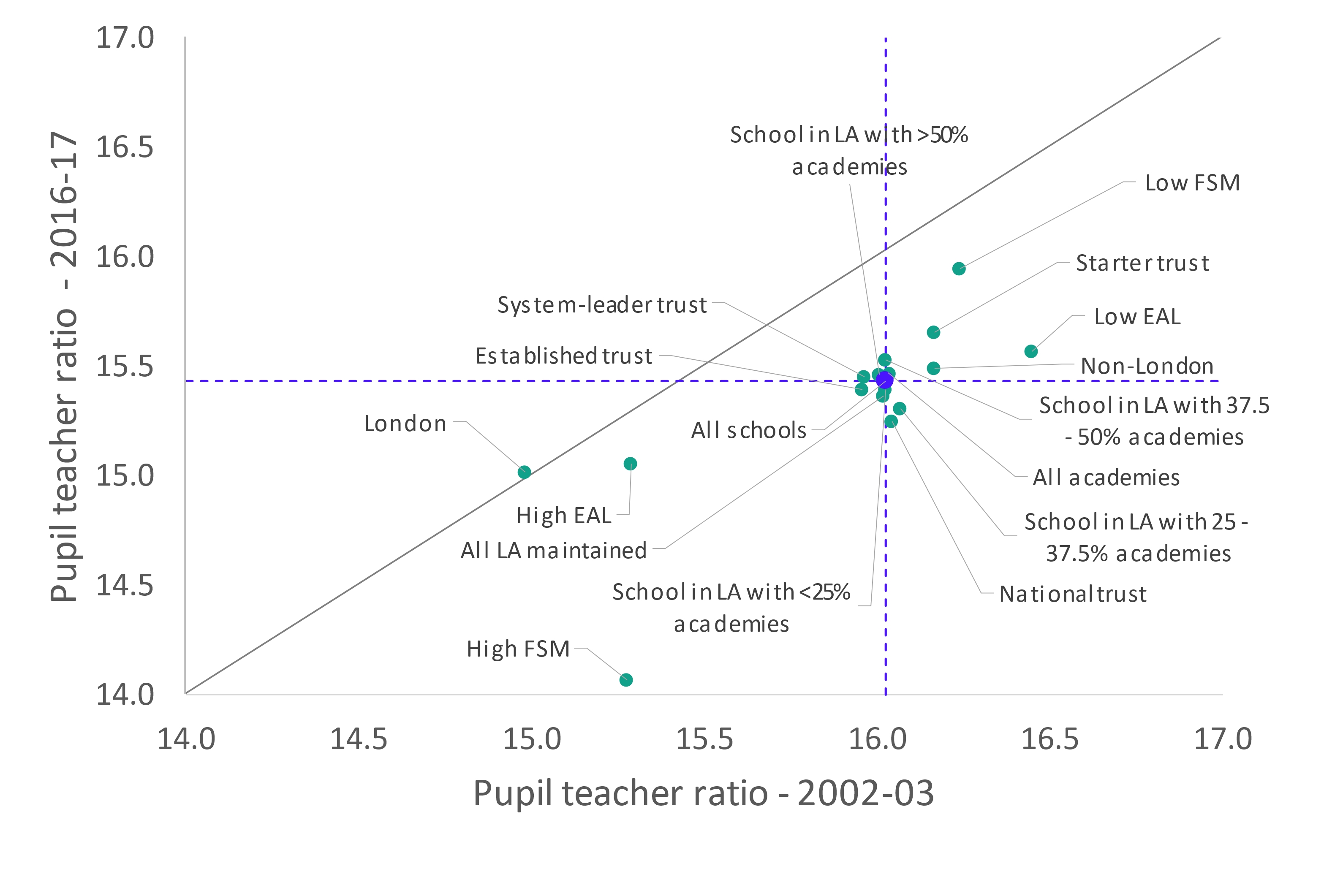
Figure 11: Change in pupil teacher ratio between 2002-03 and 2016-17 – secondary
Conclusion
Expenditure on teachers represents the largest area of spend for schools. But while per pupil expenditure increased by 42 per cent in real terms between 2002-03 and 2010-17, expenditure on teachers grew much more slowly at 17 per cent and, in fact, per pupil expenditure fell after 2012.
Amongst primary schools, being in London or having high levels of disadvantage were associated with higher per pupil expenditure on teachers while there was little variation between other characteristics examined. For secondary schools, having high proportions of pupils with English as an additional language also meant, on average, spending more. Such characteristics have been associated with large increases since 2003, and despite falls in expenditure in the later years examined, the pupil teacher ratios in 2017 were lower than they had been in 2003. More recent data on teacher numbers however suggests that these are increasing.
The expenditure in London was less than might be expected given the differences in teacher pay yet London still had relatively low pupil teacher ratios implying a different teacher mix to elsewhere, with a higher number of ‘less expensive’ teachers (such as those who are early in their career). We have also found interesting spending patterns amongst secondary schools that joined large academy trusts. Prior to joining a trust, these schools appear to have had some of the largest increases in expenditure between 2003 and 2010 (pre-academisation) but then some of the largest reductions between 2010 and 2017. They also saw some of the largest fluctuations in their pupil teacher ratios. This could reflect a different approach to workforce management and deployment in these trusts, though we do not demonstrate in this analysis precisely when such a change occurred.
[1] Broad estimates based on average classroom teacher salaries in 2016-17 of £33,500 in primary schools plus on-costs.
[2] Based on average classroom teacher salaries in 2016-17 of £36,700 in secondary schools plus on-costs.
[3] Average salaries derived from classroom teacher salaries in DfE ‘School workforce in England: November 2016’.
[4] See for example DfE, ‘Calculating schools block units of funding 2015-16 – technical note’, July 2014 https://assets.publishing.service.gov.uk/government/uploads/system/uploads/attachment_data/file/331375/Schools_revenue_funding_2015_to_2016_technical_note.pdf
[5] Jack Worth, Connie Rennie and Sarah Lynch, ‘Teacher supply, retention and mobility in London’, (May 2018)