Parts 1 and 2 of this blog series on school efficiency introduced:
- Why we have embarked on an ambitious research programme to identify the most effective school groups, including those that are most financially efficient; and
- The strengths and limitations of the DfE’s current approach to measuring financial efficiency, and therefore why we think it is worth developing an alternative
In this third part in the series, we introduce alternative approaches to studying efficiency which were developed in the field of economics.
The two main possible approaches are known as Data Envelopment Analysis (DEA), and Stochastic Frontier Analysis (SFA). For now, we will focus on the former, DEA, and will use this blog to introduce the concept of the production possibility frontier and how we can use it to identify the most efficient school groups.
This blog is an adaptation of passages from the methodology paper we published in October 2021 which discusses in depth our proposed approach to measuring efficiency in school groups, and presents results from our initial model. We have run a consultation alongside the publication. While the consultation has officially closed, we still greatly value feedback from education leaders and sector experts and would welcome your thoughts at any time. You can get in touch through feedback@epi.org.uk.
The ‘production possibility frontier’ tells us the greatest level of ‘output’ that can be achieved with a certain level of ‘input’
Data Envelopment Analysis, or DEA, works by estimating the production possibility frontier which, loosely defined, defines the maximum possible output that can be realistically produced given a certain level of input (or alternatively, the minimum input required to produce a certain level of output). For example, a shoe-making factory can realistically only make so many shoes with a set amount of fabric. A production possibility frontier for such factories would identify the maximum number of shoes that can realistically be made per square metre of fabric.
The production frontier can be estimated by analysing the inputs (e.g. square metres of fabric) and outputs (e.g. number of shoes) of a sample of decision-making units (DMUs). DMUs can be anything from firms, factories, hospitals to regions or countries – or schools or school groups.
Figure 1: Illustration of a production possibility frontier with one input and one output.
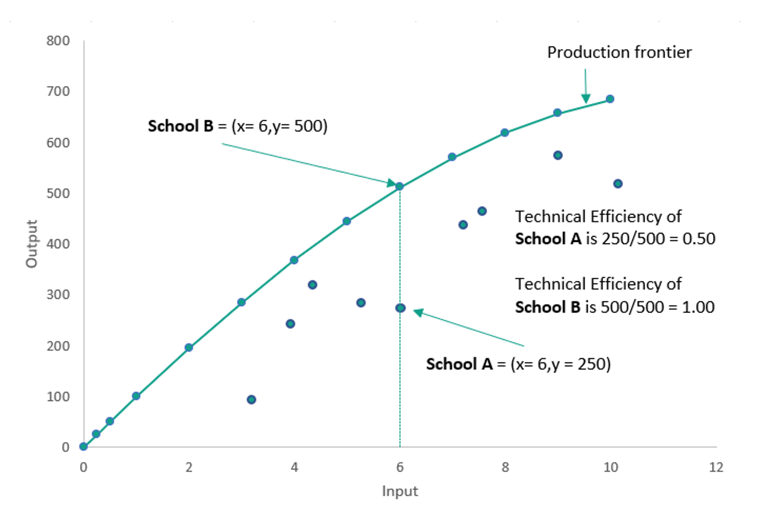
The green curve on Figure 1 depicts the production possibility frontier, which represents the maximum possible output that is producible with each level of input.
The curve is created by plotting the input and output values of a sample of decision-making units (DMUs). In this case let’s say they represent schools. A curve is then drawn through the upper-most points, that is to say, the points which have the very highest level of output at each level of input. This leaves us with a curve which envelopes all other points on the plot, hence the name of the method Data Envelopment Analysis.
The schools that lie on the production possibility frontier (e.g. School B) are said to be perfectly efficient within this method, as no other school produces more output with that same level of input.[1] Also labelled on the chart is School A. We can see that Schools A and B have the same levels of input. Despite this, School B achieves double the level of output compared with School A.
We can use this information to calculate an efficiency ‘score’ for these two schools, by looking at the ‘distance’ between each school and the frontier. In this hypothetical example, the highest possible output at this level of input is 500 (as evidenced by School B). School A produces half of that possible amount, 250, and so its technical efficiency is 250/500 which is equal to 0.50. We can therefore say that School A is 50 per cent efficient, or equivalently that it has an efficiency score of 0.50.
Meanwhile, School B lies on the frontier and produces the maximum possible output of 500. School B’s technical efficiency is therefore equal to 500/500, meaning that it has an efficiency score of 1.00, or equivalently that School B is 100 per cent efficient.
By this method, every school in the sample can be assigned an efficiency score based on their distance from the frontier at their given level of input.
Data Envelopment Analysis is a useful method for estimating the efficiency of complex public sector organisations
The illustration in Figure 1 includes only one input and one output. Evidently, if we are estimating the efficiency of complex organisations such as schools and hospitals, it is far more appropriate to consider a range of inputs and outputs. DEA is a method which allows us to do this.
Indeed, we are mindful that the terms “input” and “output” do not sit easily within education. There is not a set of proscribed inputs that make an effective school or trust, and neither is there a single definition for the desired outputs.
In spite of this, DEA has been particularly favoured in economic literature as a method for measuring the efficiency of schools and of other public services, precisely because it allows for multiple definitions of an effective school. The term “inputs” can be read as representing the key decisions that school leaders make about how to employ their resources to ensure positive outcomes. In addition, the term “output” refers to the school’s effectiveness in delivering positive outcomes for young people.
DEA starts from the premise that DMUs operating within the same industry or service do not all seek to maximise their productivity in the same way. This makes it especially suited to analysing efficiency in public services such as education and health, where inputs and outputs are not strongly defined by prices. Instead, DEA allows that DMUs will favour different combinations of inputs and outputs depending on the ‘mission’ of their operation. An example given in Johnes’ review of economic approaches to school efficiency is that one university might attach more weight to the quality of its graduates, whereas another may focus more on widening participation in its admissions policies.[2] Equally, a training hospital might spend more on teaching resources to achieve positive outcomes for patients compared with a private hospital.
Within certain constraints (e.g. practical or statutory constraints), each DMU has its own definition of optimum outcomes and the preferred way of achieving it. The benefit of applying this to education is clear in that it recognises that are multiple definitions of positive educational outcomes and multiple approaches to providing these to young people.
How is this agnosticism actually translated in the method? DEA uses a technique called linear-programming to assign weights to each DMU’s inputs and outputs, and then expresses efficiency as the ratio of weighted sum of outputs to the weighted sum of inputs for each DMU: For each DMU x, the DEA finds the optimum set of weights to attach to each input and output, such that DMU x’s output/input ratio is as close as possible to one (i.e. perfect efficiency), with the constraint that applying those same weights to each DMU in the set must not produce an output/input ratio exceeding one. Essentially, the DEA assumes that DMU x has the optimum operation for maximising its outputs, and then asks, if all DMUs did it this way, how efficient would DMU x be by comparison?
The drawbacks of DEA include (a) the fact that any deviation from the frontier is interpreted as inefficiency, without allowing for random differences (‘noise’) or data error; and (b) the inability to test hypotheses or to understand the contribution of different explanatory variables to the output measure or to inefficiency. Stochastic Frontier Analysis (SFA) is an alternative which does not have these drawbacks, but has other limitations of its own. As we further develop our work in this area we plan to include SFA in our analysis.
An example of DEA applied to secondary schools in England, using two inputs and one output
To demonstrate how DEA works as a method, and to illustrate what it can tell us about school efficiency, we present here an example of DEA applied to secondary schools in England.
Our full model (which uses four inputs – teacher experience, school leadership, expenditure on support staff and expenditure on ‘back office’ functions – and one output – pupil outcomes) can be found in our published methodology paper, and its design and results will be detailed further in following blogs.
In this illustration, we use two inputs (teacher experience and school leadership) and one output (pupil outcomes) because this is the greatest number of inputs that can be straightforwardly visualised.
In future blogs, we will go into greater detail of how we have selected our input and output variables, as well as their strengths and limitations. If you would like to read this discussion in full now, all details can be found in our methodology paper (pages 15-21). A brief explanation is provided here.
Our output measure in this example is a ‘value-added’ measure of pupil outcomes, which adjusts pupil attainment for the characteristics of the cohort. We create this by taking each DMU’s average Attainment 8 score and dividing it by the attainment that would be predicted by national data for that school or trust, given the prior attainment and other characteristics of their pupil intake. This predicted attainment is derived using multi-level modelling of the National Pupil Database 2018/19. In real-world terms, this measure represents the extent to which a school or trust enables its pupils to achieve higher than they would on average in any school, based on their characteristics such as prior attainment, gender, and disadvantage. The score represents the number of points achieved for every point that was predicted. Scores above 1 mean the pupils in the DMU achieve higher than their predicted attainment. Scores below 1 mean pupils in the DMU achieve lower attainment than would be predicted.
The input measures we select in this two-input example are:
- The full-time equivalent (FTE) of school leaders, divided by pupil FTE. School leaders include executive headteachers, headteachers, assistant, deputy heads and other equivalent roles.[3]
- The FTE of qualified experienced teachers, divided by pupil FTE. We define a teacher as ‘experienced’ if they have been qualified for at least five years.[4]
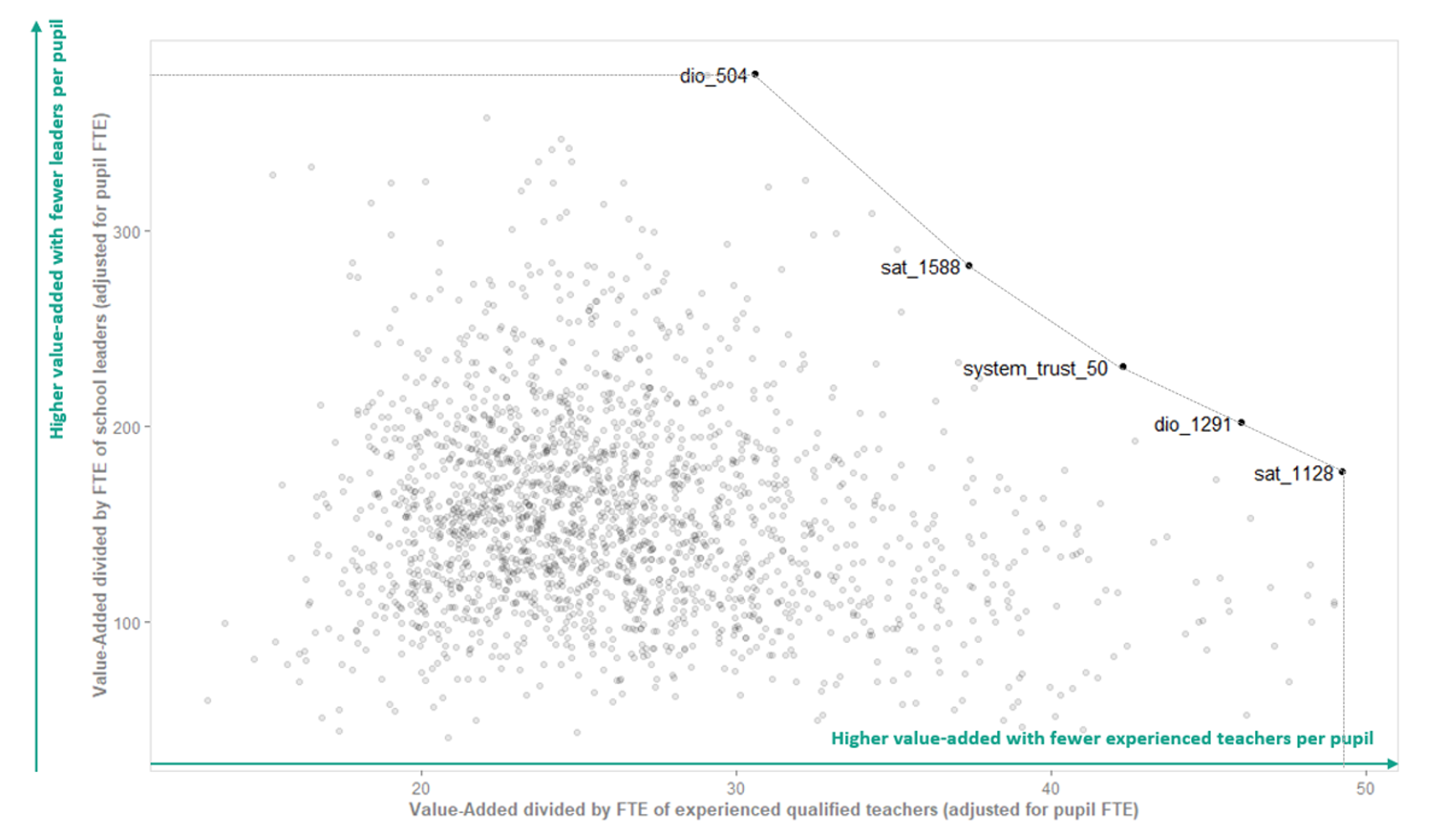
Results of two-input DEA analysis example
To visualise the results of this two-input DEA, we can use a simple scatter chart to visualise the production possibility frontier which was outlined in the introduction of this report.
To do this, for each DMU we divide its output by each of its input values. These output-input ratios effectively tell us how much output a DMU is achieving per unit of each of its inputs. The higher the value of an output-input ratio, the greater level of output is being achieved per unit of input.
We then plot these output-input ratios one against the other and draw a curve through the outer-most points to envelop the rest (Figure 2). The DMUs that lie on this curve are judged perfectly efficient by this analysis. They represent the schools and multi-academy trusts which achieve the highest value-added for their pupils, given the number of leaders and experienced teachers they employ.
For example, the DMU we have labelled ‘sat_1128’ is an example of a single-academy trust that is assessed to be fully efficient due to having a particularly high ratio of output to number of experienced teachers (49.22). Sat_1128 has 25 experienced qualified teachers for every 1,000 pupils, and its pupils achieve 1.24 Attainment 8 points for every point predicted based on their characteristics. This makes for a ratio of about 49 (1.24 divided by 0.025), or more intuitive would be to divide 1.24 by 25 and say that for every thousand pupils, each teacher enables them to achieve 0.049 points higher in Attainment 8 for every point they were predicted.
By contrast, dio_504 has a comparatively low output-to-teacher ratio (30.62), and yet it is still efficient and located on the production possibility frontier. This is because it achieves high value-added (1.14) with a particularly low number of leaders per pupil (three leaders for every thousand pupils). This demonstrates that, within this methodology, it is recognised that there are multiple ways of successfully running a school: two DMUs can have very different combinations of inputs and yet they can each be assessed as equally efficient.
Not labelled on Figure 2 are the DMUs with lower efficiency scores (i.e. those that do not lie on the production possibility frontier). We know from the full set of results that some of the least efficient DMUs have the same value-added score (1.09) as two of the fully efficient DMUs. These schools are nevertheless ranked as less efficient in this two-input example because they achieve a value-added score 1.09 with significantly higher staff inputs. For example, a less efficient DMU has 16 leaders and 68 experienced qualified teachers per thousand pupils. According to this DEA analysis, we know it is possible for a DMU to achieve the same level of output with substantially lower staff inputs, and therefore DMUs with higher staff inputs are classed as running with inefficiencies.
This highlights an important feature of DEA: it is assumed that a lower level of input is always desirable. A simple DEA like the two-input example presented here does not take into consideration sustainability, or possible risks of operating with a reduced workforce due to staff burnout and lower retention. We are mindful of these drawbacks and, as we develop our models, we wish to include indicators of sustainability.
Figure 2: Two-input example: Efficiency of KS4 schools and MATs
Overall, what does this approach tell us? Essentially, compared with the DfE’s efficiency metric, these results provide school leaders with clearer routes to becoming more efficient. Not only can a school leader see where their school lies in relation to the production possibility frontier, they can also compare their ‘mix’ of inputs with that of their peers.[5] This might prompt leaders to alter their deployment of resources, for example their staffing structure, or may prompt them to enquire into why a school is achieving better outcomes with similar use of resources. In addition, the output measure in our DEA analysis is more contextualised than a standard progress measure like Progress 8, because it it accounts for pupil characteristics beyond prior attainment.
We note that DfE have made use of DEA in their work to review efficiency in the school system. DEA was used to identify a number of what they refer to as ‘typically efficient’ schools with which to conduct further qualitative research.[6] This research informed the design of their present tool, which has the strengths and limitations discussed in part 2 of this blog series.
Now we have introduced and illustrated the method we have used to develop our proposed methodology for measuring the efficiency of school groups, we’ll use the next blog to discuss the details of its design. What inputs and outputs should we select in our full model? How should we calculate these inputs and outputs if we are aiming to understand the efficiency of school groups, and whether schools can achieve efficiency in numbers? For example, with a multi-academy trust, should we consider the efficiency of its individual academies, or look at the inputs and outputs of the trust as a whole?
[1] Note that this means they are the most efficient of the sample, and if our sample does not comprise the entire population of schools in England then we cannot be sure there is not a still more productive school beyond the sample.
[2] Geraint Johnes, “Chapter 35 – Economic Approaches to School Efficiency,” in The Economics of Education (Second Edition), ed. Steve Bradley and Colin Green (Academic Press, 2020), 479–89, https://doi.org/10.1016/B978-0-12-815391-8.00035-5.
[3] Sourced from publicly available school-level timeseries derived from School Workforce Census, Teacher and support staff Full-time Equivalent and headcount numbers for schools, DfE.[3] Combined with publicly available school-level timeseries of pupil FTE (schools, pupils and their characteristics).
[4] Constructed from School Workforce Census contract data. Years of experience are calculated as the number of days to the closest year between the census date and the date of qualification. This total is then weighted by the FTE of experienced qualified teachers. We defined ‘experienced’ teachers as those with at least five years’ experience since qualifying. We weight the total years because more experienced teachers are more likely to have lower FTE, and are also most likely to have a positive impact on pupil outcomes. Due to suppression rules we only include schools with at least five classroom teachers.
[5] The word ‘peers’ has a specific meaning in DEA. The method can be used to identify a ‘peer group’ of operationally similar schools, that is to say schools with similar mixes of inputs and outputs. Members of the same peer group can compare themselves with each other (using further qualitative or quantitative enquiry), and particularly with the most efficient member, to understand how they can each achieve greater efficiency.
[6] Department for Education, ‘Review of Efficiency in the schools system’, June 2013